3 Research Photos

|
|
Objectives
- Take photos of a person.
- Edit photos to over saturate
20 Unedited Photos
4 Edited Photos
1 Printed/Matted Photo
5 Step Critique
1. Observe
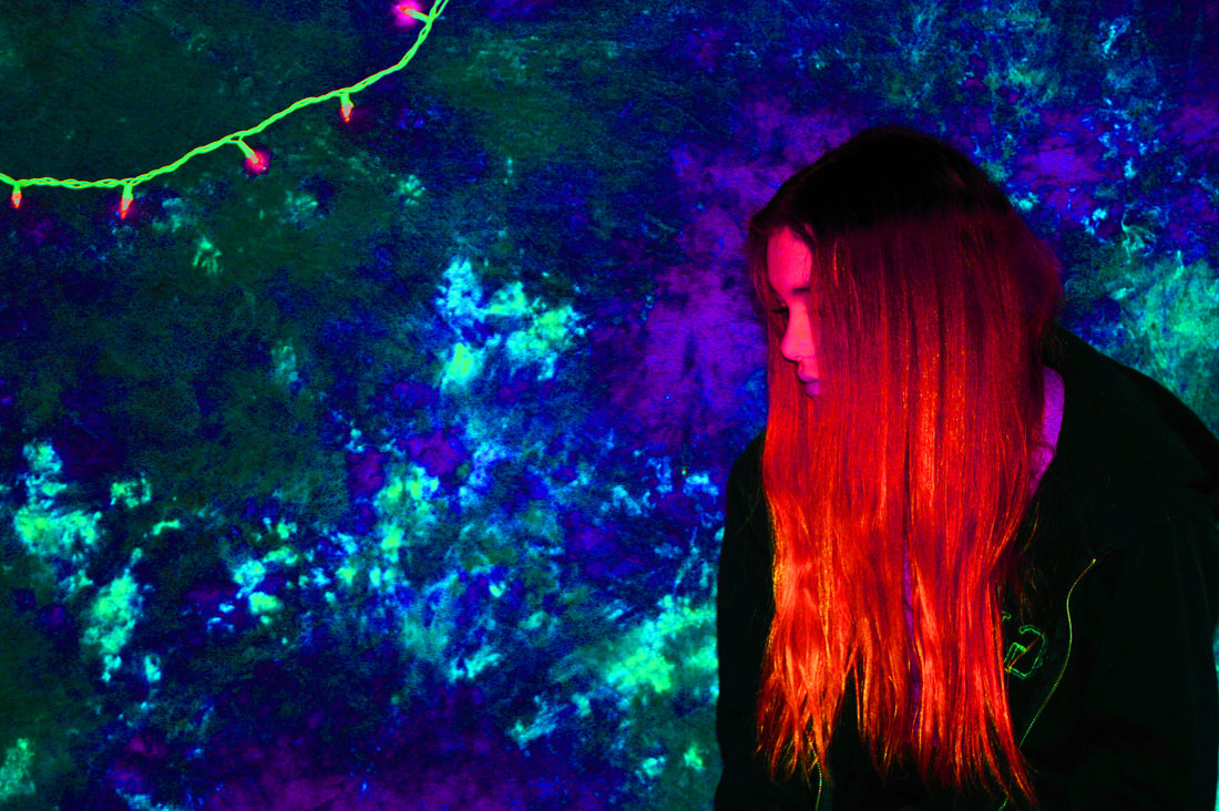
2. Describe: This photograph is a 13" x 19" print on matte paper of a blonde girl against a marbled background with a small amount of string lights coming across the left top corner. The girl is positioned all the way to the right of the photo and her head is almost at the top. It is taken at a level angle in portrait mode. It has a large amount of depth to it because of how the background and her jacket contrasts with her hair and face. In editing I adjusted the hues to be extremely off center to make it look as if everything is glow in the dark which makes her hair become a fluorescent red/pink, the background dark/light neon blue and dark neon green, the light string becomes neon green, and the lights become neon pink. The background was originally purple, pink, and white.
3. Analyze: One element of art that this photo best represents is color and it creates the principle of design of emphasis. The color palette is very bright through the photo which emphasizes the girl to be more contrasting to the background. This works well because the subject matter is supposed to be a lot more stand out stemming from the fact that this is meant to be a sort of portrait and with portraits the person is supposed to be the focal point. Another element in this photo would be shape which creates the principle of proportion. The size of the shape of the girl is about 1/3 of the photo, but the amount of background does not need to be exactly even because of how the color has emphasized the subject matter. These add to the loud feeling.
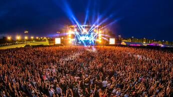
4. Interpret: My interpretation of this photo is graphic and contemporary themed. It reminds me of a music festival/large party because of how loud/bright the colors are. I think the message is to portray how color pallets are commonly associated with certain events. This explores the psychological aspect of photography because of how the mind associates colors with feelings/events such as how a grey toned pallet can give the viewer a more melancholy feeling. This photograph addresses the theme that through association with physical aspects, the viewer can interpret meaning, feeling, and memories.
5. Evaluate: I think that this photo is successful because of how the colors popped and completely contrast with their original value exactly how I intended them to. The color palette is extremely loud and neon, and the shade range is incredibly different than expected which would intrigue the viewer. This makes me want to learn more about the effect of inverse coloring in photography further, such as comparing a regularly colored photo with a very clearly edited one. I feel like this photo could have been improved if the girl had on a different colored top to have that contrast more with the background because now it sort of blends in with it. The photo would have been more interesting if there were more people included.
1. Observe
2. Describe: This photograph is a 13" x 19" print on matte paper of a blonde girl against a marbled background with a small amount of string lights coming across the left top corner. The girl is positioned all the way to the right of the photo and her head is almost at the top. It is taken at a level angle in portrait mode. It has a large amount of depth to it because of how the background and her jacket contrasts with her hair and face. In editing I adjusted the hues to be extremely off center to make it look as if everything is glow in the dark which makes her hair become a fluorescent red/pink, the background dark/light neon blue and dark neon green, the light string becomes neon green, and the lights become neon pink. The background was originally purple, pink, and white.
3. Analyze: One element of art that this photo best represents is color and it creates the principle of design of emphasis. The color palette is very bright through the photo which emphasizes the girl to be more contrasting to the background. This works well because the subject matter is supposed to be a lot more stand out stemming from the fact that this is meant to be a sort of portrait and with portraits the person is supposed to be the focal point. Another element in this photo would be shape which creates the principle of proportion. The size of the shape of the girl is about 1/3 of the photo, but the amount of background does not need to be exactly even because of how the color has emphasized the subject matter. These add to the loud feeling.
4. Interpret: My interpretation of this photo is graphic and contemporary themed. It reminds me of a music festival/large party because of how loud/bright the colors are. I think the message is to portray how color pallets are commonly associated with certain events. This explores the psychological aspect of photography because of how the mind associates colors with feelings/events such as how a grey toned pallet can give the viewer a more melancholy feeling. This photograph addresses the theme that through association with physical aspects, the viewer can interpret meaning, feeling, and memories.
5. Evaluate: I think that this photo is successful because of how the colors popped and completely contrast with their original value exactly how I intended them to. The color palette is extremely loud and neon, and the shade range is incredibly different than expected which would intrigue the viewer. This makes me want to learn more about the effect of inverse coloring in photography further, such as comparing a regularly colored photo with a very clearly edited one. I feel like this photo could have been improved if the girl had on a different colored top to have that contrast more with the background because now it sort of blends in with it. The photo would have been more interesting if there were more people included.
