3 Research Photos
|
|
|
Objectives
- Take photos that have not got a foreground and background.
- Use the layering tool in Photoshop.
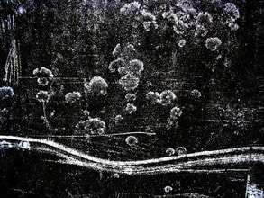
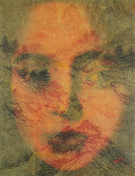
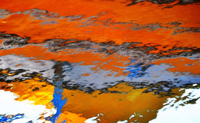
20 Unedited Photos
4 Edited Photos
1 Printed/Matted Photo
5 Step Critique
1. Observe
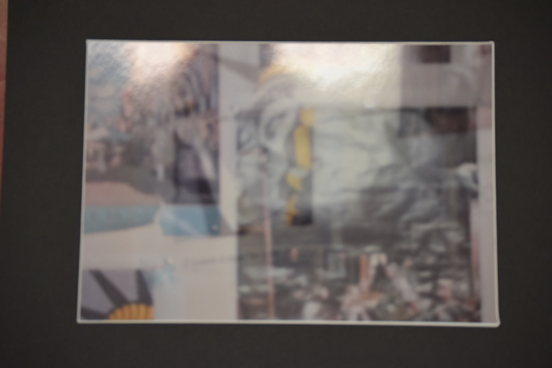
2. Describe: This photograph is a 13" x 19" print on glossy paper of a few posters on a wall with another picture of a poster layered on top of it. There is one poster in the top left corner that is cut off and it stops a little past half way vertically and stops a little under halfway across horizontally. It contains a level street view of a building and a cafe with umbrella tables outside. Another poster takes up most of the right side of the photo (stops about an inch from the right, a little past halfway across, and a little under the top of the photo). This one is mostly black with some figures of people at the bottom that are cut off at about the waist who look like they are at some kind of concert. A small portion of a third poster can be seen in the bottom left corner and it contains the top right of The Statue of Liberty. This photo is severely blurred. The photo layered on top of it is of the full poster with the Statue of Liberty on it, however, it is in more of a pop art style so her crown is colored in black and yellow (it is drawn only from the crown to the neck and from a side view on the right). It is taken at a level angle in automatic mode with flash, so there is a bit of a bright spot in the middle and the opacity of the layered photo has been turned down to about 35%. In editing I only adjusted the contrast to be slightly lower to make it look a little bit flatter so that you feel like your super up close to it. These photos were taken in a pitch black bathroom, and the wall behind the posters is white. The posters each have about an inch of space in between them, and the top layered photo's poster is slightly more up from center.
3. Analyze: One element of art that this photo best represents is line and it creates the principle of design of rhythm. The lines of the posters are evenly spaced out through the photo which gives rhythm because it is all one type of subject matter creating the same angled lines. This works well because the each of the subjects are different within themselves so it is great that the rhythm can give some kind of unity between each of them. Another element in this photo would be value which creates the principle of emphasis. The contrasting values of the layered photos emphasizes the less opaque one on top. I feel that this creates a complexity that would not have been there if it was one photo which gives a feeling to the viewer that this is definitely contemporary art as opposed to vintage photography.
4. Interpret: My interpretation of this photo is that the concept of modern/abstract/contemporary art as a whole is encompassed. It reminds me of an art museum because of how abstract a lot of the pieces are in them, and I think that this whole genre really interesting within itself. I think this because there are a million different ways to interpret pieces within this genre of art, whereas before this genre got popular people were just receiving inspiration from whatever was right in front of them. With the abstract genre the artist has got to draw inspiration from their own imagination while also incorporating a concept behind it so that it can still draw feeling/meaning from the viewer. I think the message is to portray how abstract art doesn't have to be this far away thing that is impossible to get right without it being too simple. This explores the aspect of art in general that doesn't really respect abstract creativity because of how the viewer can be easily bored by it. However, I think that viewers can also be easily bored by something like a portrait. This photograph addresses the theme that creativity has to be backed up by a concept, so as not to become outdated and remain timeless.
5. Evaluate: I think that this photo is successful because of how the layering of the two photos gave the effect of being more contemporary/modern, and I suppose more with the current trends in art. The layers create this kind of trippy affect which confuses the audience into not knowing exactly what to look at. This is also further pushed by how there is not a distinguishable foreground and background. This has definitely inspired my to explore this genre of art further. I feel like this photo could have been improved if there was maybe another photo layered as well to confuse the eye even more, or maybe it could have been better if the color pallets of the two photos were on opposite sides of the spectrum.
1. Observe
2. Describe: This photograph is a 13" x 19" print on glossy paper of a few posters on a wall with another picture of a poster layered on top of it. There is one poster in the top left corner that is cut off and it stops a little past half way vertically and stops a little under halfway across horizontally. It contains a level street view of a building and a cafe with umbrella tables outside. Another poster takes up most of the right side of the photo (stops about an inch from the right, a little past halfway across, and a little under the top of the photo). This one is mostly black with some figures of people at the bottom that are cut off at about the waist who look like they are at some kind of concert. A small portion of a third poster can be seen in the bottom left corner and it contains the top right of The Statue of Liberty. This photo is severely blurred. The photo layered on top of it is of the full poster with the Statue of Liberty on it, however, it is in more of a pop art style so her crown is colored in black and yellow (it is drawn only from the crown to the neck and from a side view on the right). It is taken at a level angle in automatic mode with flash, so there is a bit of a bright spot in the middle and the opacity of the layered photo has been turned down to about 35%. In editing I only adjusted the contrast to be slightly lower to make it look a little bit flatter so that you feel like your super up close to it. These photos were taken in a pitch black bathroom, and the wall behind the posters is white. The posters each have about an inch of space in between them, and the top layered photo's poster is slightly more up from center.
3. Analyze: One element of art that this photo best represents is line and it creates the principle of design of rhythm. The lines of the posters are evenly spaced out through the photo which gives rhythm because it is all one type of subject matter creating the same angled lines. This works well because the each of the subjects are different within themselves so it is great that the rhythm can give some kind of unity between each of them. Another element in this photo would be value which creates the principle of emphasis. The contrasting values of the layered photos emphasizes the less opaque one on top. I feel that this creates a complexity that would not have been there if it was one photo which gives a feeling to the viewer that this is definitely contemporary art as opposed to vintage photography.
4. Interpret: My interpretation of this photo is that the concept of modern/abstract/contemporary art as a whole is encompassed. It reminds me of an art museum because of how abstract a lot of the pieces are in them, and I think that this whole genre really interesting within itself. I think this because there are a million different ways to interpret pieces within this genre of art, whereas before this genre got popular people were just receiving inspiration from whatever was right in front of them. With the abstract genre the artist has got to draw inspiration from their own imagination while also incorporating a concept behind it so that it can still draw feeling/meaning from the viewer. I think the message is to portray how abstract art doesn't have to be this far away thing that is impossible to get right without it being too simple. This explores the aspect of art in general that doesn't really respect abstract creativity because of how the viewer can be easily bored by it. However, I think that viewers can also be easily bored by something like a portrait. This photograph addresses the theme that creativity has to be backed up by a concept, so as not to become outdated and remain timeless.
5. Evaluate: I think that this photo is successful because of how the layering of the two photos gave the effect of being more contemporary/modern, and I suppose more with the current trends in art. The layers create this kind of trippy affect which confuses the audience into not knowing exactly what to look at. This is also further pushed by how there is not a distinguishable foreground and background. This has definitely inspired my to explore this genre of art further. I feel like this photo could have been improved if there was maybe another photo layered as well to confuse the eye even more, or maybe it could have been better if the color pallets of the two photos were on opposite sides of the spectrum.
